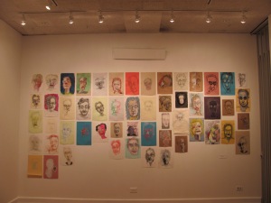
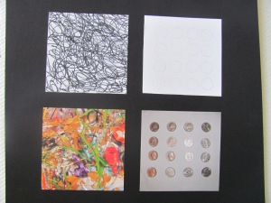
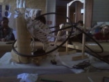
Self Portrait

IMG_5826 IMG_3546IMG_3557


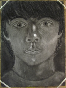
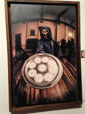
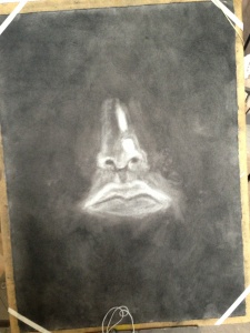
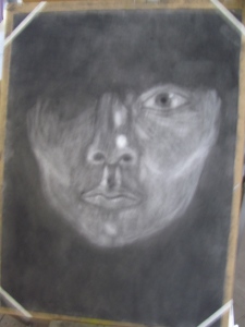
This art project is definitely my favorite, I’ve also put so many hours into it! To create this self-portrait, I blacked out the paper with charcoal and used a rubber eraser to show the different shapes and areas of light on my face. I think it’s really interesting process to use a eraser to create art, I mean erasers usually delete things not create them! Honestly, everything was incredibly difficult for this project. Trying to create a proportional face while closing one eye was not an easy task. I also had difficulty to not idealize my features. I made my lips too big and my cheeks too small, and I had to spend many hours trying to make the lips look like my lips. After my project started coming together I saw that with those changes the self-portrait did start to look like me. I feel very proud of this project!

Overall, this visual thinking art class has taught me to really see and observe. I understand values of lightness and dark. I understand how to draw what I see and block out what I know. I have always attempted to try to draw real things before this class, and I would usually give up and decide to draw only cartoonish looking people and animals, but know that I know how to see and use string to help make things proportional, I think things will become much easier. I’ve also always felt that I couldn’t do art because I wasn’t great at drawing or painting so I’ve stayed away from art classes and college until now, and now I realize that I can make art, and that’s a great feeling. And to address this question: how does how you see effect how you think? I feel that I see things differently, I’m a better observer now and I’ve learned to fight my brain which sometimes tries to trick me into placing the importance of what I know over what I see.
 

Waste Land

Waste Land is a documentary about an innovative artist Vik Muniz, who uses garbage material to create art. Muniz traveled to Rio de Jeniero, Brazil to carry out his project in the world’s largest landfill Jardim Gramacho. Muniz photographed some of the pickers at the landfill, and then was able to project huge blown up versions of the photographs on the concrete floor inside a building. The pickers used trash that they gathered earlier to recreate their portraits on the photographs. Muniz photographed the final creations and put them on canvases for an art exhibition and an art auction. Muniz brought new perspectives to these pickers. After the pickers created this art, they gained new perspectives on life, by realizing that they did not have stay and pick garbage for the rest of their life. In this way, Muniz was able to change their outlook on life and show that they could escape the landfill. The pickers were able give Muniz satisfaction with the artwork they both created, he felt that improving these people’s lives was a rewarding experience. The groups in this documentary were Association of Pickers Jardim Gramacho (group thats represents the pickers of the landfill and their legal rights), the museum of modern art in Rio de Janeiro, and Muniz and his assistant. One of the systems that I observed in this documentary was poverty. The poor in Brazil are stuck in a cycle of poverty and have no way out. This extreme poverty is shown when Muniz visits the pickers’ homes, who live in favelas (slums).  Muniz project subverts this system of poverty by showing some of the pickers a new way of life and that they can break away from this cycle and by providing them with their artwork’s profits. However, I would argue that Muniz’s project also supports the system of poverty because he improves the lives of only some of the pickers, while the pickers who are not picked are still left behind in poverty. While Muniz had good intentions with his project there are many problems with this project. The ability to change someone’s perspective  on life should not be taken lightly, and I feel that this is something that Muniz did not realize or consider enough. If these selected pickers find themselves out of money and they have to go back to working at other jobs similar to their job at the landfill (since it shut down) they will probably be more unhappy then they would have been without Muniz’s project changing their life. Also I think this project probably created some animosity between the pickers who were selected for the project and the ones who were not. The long term implications are that the pickers were able to improve their lives with the proceeds of their artwork, and Muniz used funding to open a learning center for the pickers, since the landfill was shut down.

On campus art event: Material Witness

IMG_3422 IMG_3439IMG_3486 IMG_3474 IMG_3430

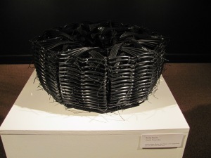
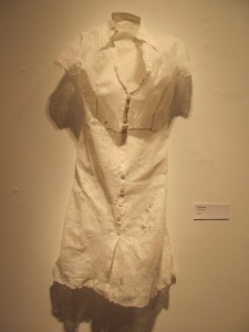
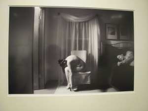
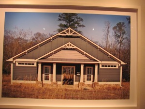
Material witness was an art exhibition at Agnes Scott College in the fall of 2013. This exhibition was composed of art from a collaboration with the Women’s Caucus for Art of Georgia. I think the contents of this art is reactionary. I say this because I believe that the purpose of the art at this exhibition was to show the viewer what is behind the scenes of their art. For instance, at first glance the basket in the first picture looks like its weaved from black plastic material, and after I stared at the basket for a while I realized the basket was composed of 3-D glasses. I thought the dress in the picture was made from cloth, but I learned from the description of the art it was made of paper. Basically the material was not what I thought it was, and this was surprising. The third picture shows a private setting suggests a certain sadness by the form of the woman bending over, and this might be behind the scenes of a relationship. I found the forth picture very interesting, because at the first glance I thought it was just a house, but when I looked more closely I saw that behind the door was not the inside of the home, but the outdoors. In art class, we have learned how to use material to create certain ideas by relying on formal and literal qualities, which these artists have also done in their work at the material exhibit.

Off Campus art event: Flux night 2013


IMG_0343 IMG_0360

IMG_0363


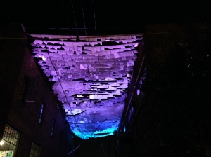
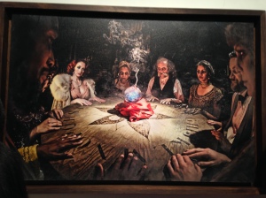
For my off campus art event I went to Flux night 2013 in Atlanta on October 5th. The description for the event explained that flux night is a night of art + experimentation. I think the contents of the event’s art content was experimental, because of the different variety of art, there were sound and light installations, art galleries, performances (lantern parades on the street, ballet dancers dancing to no music), and music (bands playing on the street). This variety made the event experimental because there was no common theme among the different art forms. This experimental concept relates directly to what we are doing in class, since we are experimenting every time we work on our different art projects. Every project I find myself having to fight what I know and try to just see without my previous knowledge making my projects more difficult, this learning process is an experiment in itself. I have put my favorite parts of the event above. The first picture on the left is of a  light installation called an inversion of sky and land. This installation would change color and the small rectangular parts would move with the wind. The second and third pictures are from an art collection called Black Curtain by the Dorn Brothers photographers. The second picture is called “The Summoning” and the third is called “Open Doors”. I love these photographs because they are so unique and I definitely see that the photographers have used shadows in their photographs to create an ominous presence of darkness. Unfortunately, wordpress won’t let me upload a video, but I have included a link to a band  performance at Flux here: http://www.youtube.com/watch?v=sg_XPEInGI0

 The video doesn’t do this band justice, but I wanted to share anyways since this performance was my favorite part of Flux.


The Narcycler

IMG_3500IMG_3507IMG_3517IMG_3523IMG_3527 IMG_3522

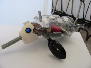
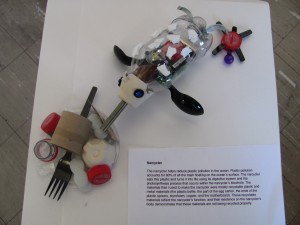
In art class we (well a small group of the class ) created animals that have superpowers that can fix social ills. I immediately decided that I would create a narwhal, but I was not sure what its superpower could be. After a bit of thinking, I decided the narwhal would help reduce pollution in the ocean. When I researched ocean pollution I found that plastic pollution accounts for 90% of the pollution on the top of the ocean’s surface. This led to the creation of the narcycler, the superwhale of the ocean! The narcycler eats  plastic pollution and turns it into life using its digestive system and the photosynthesis process that occurs within the narcycler’s blowhole.

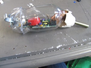
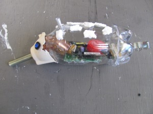
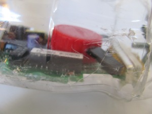
This art project helped me learn how to emphasize formal and literal qualities to get the artistic message across. I decided that using recyclable material would be the best way to reflect the narcycler’s function. And I was able to emphasize the systems that help the narcycler transform plastic material into life. For the photosynthesis process I put glitter tape around a straw to demonstrate the intake of energy through the narcycler’s blowhole. And for the digestive process that recycles plastic, I used a hollow metal screw and a hollow copper piece to show the narcycler eating  the plastic. Then I used the motherboard to show that the transformation of the plastic into animals (legs are being added on in the close up picture above). And next there is a straw poop chute (not pictured, sorry!) at the narcycler’s bottom that the completed animal comes out of.

If I had another week on my project, I think I would try and redo the head. The narcycler’s head looks a little lopsided, and I didn’t realize this until after I had hot-glued everything on. Other than this lopsided issue, I’m very happy with my narcycler!

At the art critique for our class, my classmates found that the distinctive formal quality of the narcycler were the material’s roundness.  My classmates explained that the narcycler’s  recyclable material reflects the recycling transformation within the narwhal (the literal form). Additionally, my classmates said that the materials create meaning by conveying the problem of the plastic pollution of the sea through the material. My peers also said that the roundness of the material suggests that the narcycler moves smoothly through the ocean.

Most of my classmates decided to do a graphical design project instead of the animal project. I really liked that the graphical design projects were able to portray their words successfully by arranging everyday objects to portray the meaning of their words. This project emphasizes the idea that you can use material to create a certain idea by relying on their formal and literal qualities.

IMG_3532 IMG_3541

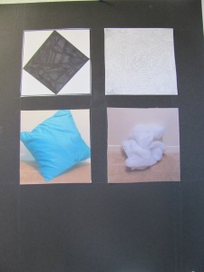
I think that Gwen Bailey’s project (left) and Rachel Brazeale’s  project (right) are very successful images of their words. Gwen’s words were obvious and subtle. I think Gwen’s project was successful because the contrast between the left and right images portray the words and the drastic difference of these words. Rachel’s words were uncontrollable and restrained. I think Rachel’s project was successful for the exact same reasons as Gwen’s.

I think that the first part of visual analysis is to describe exactly what you see instead of what you know. Then the second part of visual analysis is using what you know to interpret what you see. And the third part of visual analysis is to put the description and the interpretation together to create the overall meaning for a visual analysis of art.

Tiny animals – materials discussion

IMG_3500

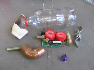
So I’ve decided that my animal will mimic the form of a narwhale.  My animal will tackle our enormous plastic pollution problem in the ocean. For right now, I’ve decided to call my animal the “narcycler”. The narcycler uses its’ digestive system and photosynthesis through its’ blowhole to help turn the recyclable material that it sucks in live animals that are composed of recyclable material.

The materials pictured above are what I’ve found to make my narcycler so far. I’m planning to have the coke bottle,  the plastic egg carton part, the hollow metal yellow piece (its near the copper piece), and the metal part that looks like a tail on the outside of my narcyler (plus the ends of plastic spoons for the fins which aren’t pictured ). I’m planning to have the rest of the material pictured above to be inside the bottle.

In class today,  we had a discussion about how the materials broadcast the power of the animal and how does it provide a message from just the material. My classmates Sadia, Amanda, and Camden all agreed that my materials work well together because the outside materials are recyclable which emphasizes the superpower of  narcycler (that it recycles through the digestive system).

We also discussed what we could consider further for the form, function , or material of the animal. Sadia advised me to make sure that I kept the form of a fish on the outside (I hadn’t brought the fins in yet). Amanda advised me to limit the outside of the narcycler to recyclable material since this material demonstrates what is occurring within the animal. Camden told me that the motherboard that I plan to put inside the narcycler’s body is a good material to use since many people do not recycle electronic equipment properly.

And our final discussion centered on the what if factor of our project. We just discussed some ideas for what the material does and other suggestions we had. Sadia advised me to have all kinds of plastic lying under the motherboards. However, I think I like the idea of having the plastic on the top, because that gives the transformation process more visibility. Amanda suggested that I could change the tail to plastic material and have it more  fan like, which would fan out all the animals it created.  And Camden suggested that the tail material that I had looks like it is a hydro electric tail that generates power. Camden’s idea helped me decide that I’m going to stick with the tail that I have. Even though the tail material is not plastic like the rest of the outside, the fact that it looks like its generating power helps to maintain my animal’s mechanical theme.

The box

IMG_3418 IMG_3487 photo (1) photo

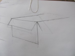
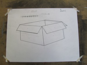
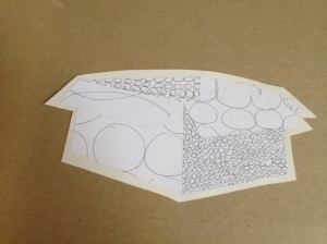
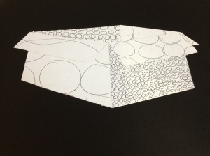
In art class we learned that an artist can create certain values to show the difference between darkness and light. The next step was to show that we understood what we learned about values through our box project. The first thing that I did for this project was drawing a box. I then created a small value scale and labeled the contrast between the different parts of the box according to our scale. When we finished drawing and labeling the box we outlined the lines of the box in sharpie. Next, I created as many different value scales as we could and then pick the value that best represented the contrast between darkness and light. Then I enlarged the value scale and used an x-acto knife to cut out the values I created on top of the photographed copy of the box. Once I finished cutting all my values out, I mounted my box onto a white paper with rubber cement. After that I cut a rough outline of the box and then proceeded to cut a more precise outline of only the box. When I finished cutting I mounted my finished box product onto a black board with rubber cement.

This project helped me learn how to create different values that show the different contrast between light and darkness. This project connects to visual thinking by showing us to really observe the different colors that we see on the same object. During this project I was a little frustrated when I was using the x-acto knife, because sometimes I would veer off from the ruler and I would have to start over. I was very close to running out of copies of my value scale, but in the end everything worked out fine.

Also, I only realized after I mounted my box to the black board that the bottom right and left edges of the box weren’t straight. For some reason when I had the box against the white paper, these edges looked relatively straight to me. Now I realize that while I was probably thinking the ruler was straight on the box, it probably wasn’t. However, I think that these edges actually gives my box an unique flare-like look and makes the box look like it will fly off the page!

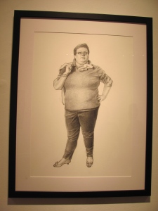
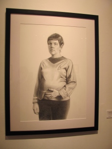
Visual Analysis of Jessica Burke’s work

IMG_3478 IMG_3482

Jessica Burke drew a women dressed up as Betty Rizzo and the other as Spock. Both of the drawings have soft lives and contrasting values of graphite which makes the drawing very defined.  Additionally the space behind the two painting forces the viewer to focus on the women in costumes.  The fact that the pregnant woman is dressed up as Spock is intriguing, since one does not usually associate Spock with motherhood or femininity.  I think these women in the drawings are challenging masculine roles with their costumes, stances , and expressions.

Carrie Mae Weems

In art class we watched a video about the artist Carrie Mae Weems in a pbs documentary. Weems uses photography to demonstrate to viewers the history of African Americans and the societal progress that has occurred over time. I think it is interesting  that Weems decided to reconstruct her own historical photographs when she did not receive permission to use the original photographs. Weems’ reconstruction definitely shows her determination. Her reconstruction of the photographs is connected to visual thinking since it demonstrates that history is often constructed and that one should be aware of who is telling the story. I think that Weems’ works expands my ideas of visual thinking by showing that that recreating original art can show different sides to a story.

My definition of art is very simple. I believe that art is whatever you make it.

Blind contour

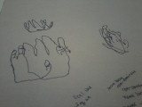
In class today we learned to draw using the blind contour method, wherein we drew objects without looking at our paper. This method was more difficult and at the same time easier than drawing the chair. I think drawing my hand was easier than drawing the chair since I didn’t have to change anything  after I finished, which was a relief. The hand was also more difficult for me to draw because I kept rushing when I was drawing. I think that not being able to see my drawing caused a sense of panic in me while I was drawing which led me to draw too fast.

Picture0923132020_1 (2)

For our first blind contour experience we drew  our hands with our dominate hand and then with our non-dominate hand (sorry for the smallness of this picture, my camera phone is not that great!). I was surprised when I found out from looking at my drawing that I paid more attention to detail when I drew with my non-dominate hand.  Also, when I was drawing I felt like I was drawing an accurate hand and this was certainly not the case!

Picture0923132144_1

For our next blind contour project we drew the random assortment of objects that are pictured in the first picture above. For the first drawing I used a pencil, and for the others I used a sharpie. Drawing with the sharpie was easier since I could feel what I was drawing whereas with the pencil I felt unsure of what I was drawing. The flowers in this assortment were my favorite thing to draw. I think I enjoyed drawing the flowers since I felt that I was actually drawing flowers, whereas with the other objects I found that I was confused on how to draw all the different sides of the object without losing my place on the paper.  When I started drawing from the inside of the objects instead of an outline I noticed objects that I didn’t even when I did the outline. I think using the blind contour has taught me to really pay attention to what I see and to actually feel  what I’m drawing. I think that this blind contour exercise connects to visual thinking since this method teaches that not thinking can be an art form.